Interior Design Mood Boards: Examples, Process, and Tools That Go Beyond the Collage
Real interior design mood boards built from specifiable materials, a working designer's six-step process, and an honest comparison of the main tools.
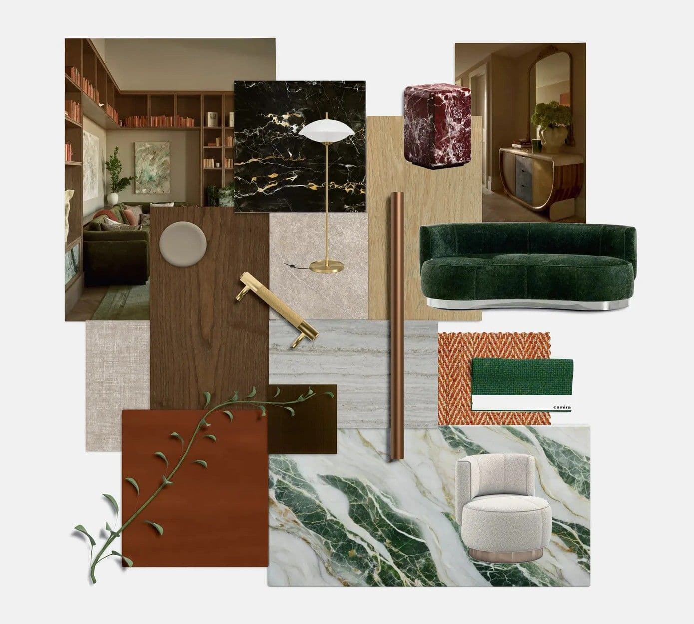
Most interior design mood boards die the moment a client says yes. The board looks beautiful, everyone agrees on the direction, and then the real work starts from scratch: what tile is that, who supplies it, does it come in the size the drawing needs? I build mood boards for a living, and the ones that survive that moment share one trait. Every element on the board is a real, sourceable product, not just a pretty picture.
This guide covers what an interior design mood board is, what belongs on one, real examples built from specifiable materials, my own six-step process, and a fair look at the main tools.
Key takeaways
- A mood board sets the emotional and material direction of a space before any drawing or specification work begins.
- The strongest boards are built from real products, so the concept can move straight into sourcing without being rebuilt.
- Include the palette, two or three hero materials, supporting textures, furniture, and lighting. Edit down until every element earns its place.
- Image-collage tools are fine for early inspiration. Designers who need to present, revise with clients, and specify need a materials-first tool.
- A mood board should hand off cleanly to a material schedule. If it cannot, it is decoration, not design work.
What is a mood board in interior design?
An interior design mood board is a curated arrangement of colors, materials, textures, furniture, and imagery that communicates the intended look and feel of a space before detailed design begins. Designers use it to test a direction, align a client's expectations, and anchor every later decision about what gets specified and bought.
Designers actually work with three related boards, and the words get used interchangeably more than they should:
- A mood board captures atmosphere: palette, texture, light, references. It answers "how should this space feel?"
- A concept board goes one step further and ties the mood to the actual project: the room, the plan, the client's brief.
- A material board is the most concrete of the three: physical or digital samples of the actual surfaces and finishes being proposed, arranged to show how they sit together.
In practice the boundaries blur, and that is fine. What matters is the trajectory: each board moves the project from a feeling toward a set of purchasable, specifiable decisions. The mistake I see most often is a mood board assembled entirely from magazine photography that cannot make that move, because nothing on it corresponds to a product anyone can buy.
What should an interior design mood board include?
A working mood board needs six kinds of content: a color palette, one to three hero materials, supporting textures, key furniture pieces, lighting, and a small amount of contextual imagery. Everything else is optional. If an element does not influence a purchasing or specification decision later, it probably does not belong.
Here is the checklist I run against my own boards:
- Color palette. Three to five colors, including at least one you are slightly unsure about. A palette with no tension reads flat in the room.
- Hero materials. The one to three surfaces the space will be remembered for: the stone on the island, the timber underfoot, the tile behind the vanity. These deserve the largest visual weight on the board.
- Supporting textures. Fabrics, carpet, plaster, metals. They stop the hero materials from floating in isolation.
- Furniture. Two or three anchor pieces, not a full inventory. The bed or sofa sets the scale of everything around it.
- Lighting. Both the fixtures and the quality of light you are aiming for. A palette that works in cool daylight can collapse under warm LEDs.
- Context imagery. One or two photographs for atmosphere. More than that and the board drifts back into collage territory.
The professional test is sourceability. A client will fall in love with the board exactly as presented, so every item on it should be something you can actually deliver: a product with a supplier, a price, and a lead time. This is where image-only boards quietly fail, and it is the single biggest difference between a moodboard made for a feed and one made for a project.
What do real interior design mood board examples look like?
The examples below are real boards we built in Matterbase Board, and each one is public: open Verdant Heritage, Wabi Elegance, Earthy Retreat or Serene Modern and inspect every sample yourself. Click any product link and the material opens in the Matterbase catalog as a photorealistic 3D sample rather than a flat photograph, so the concept and the specification are the same object.
Verdant Heritage
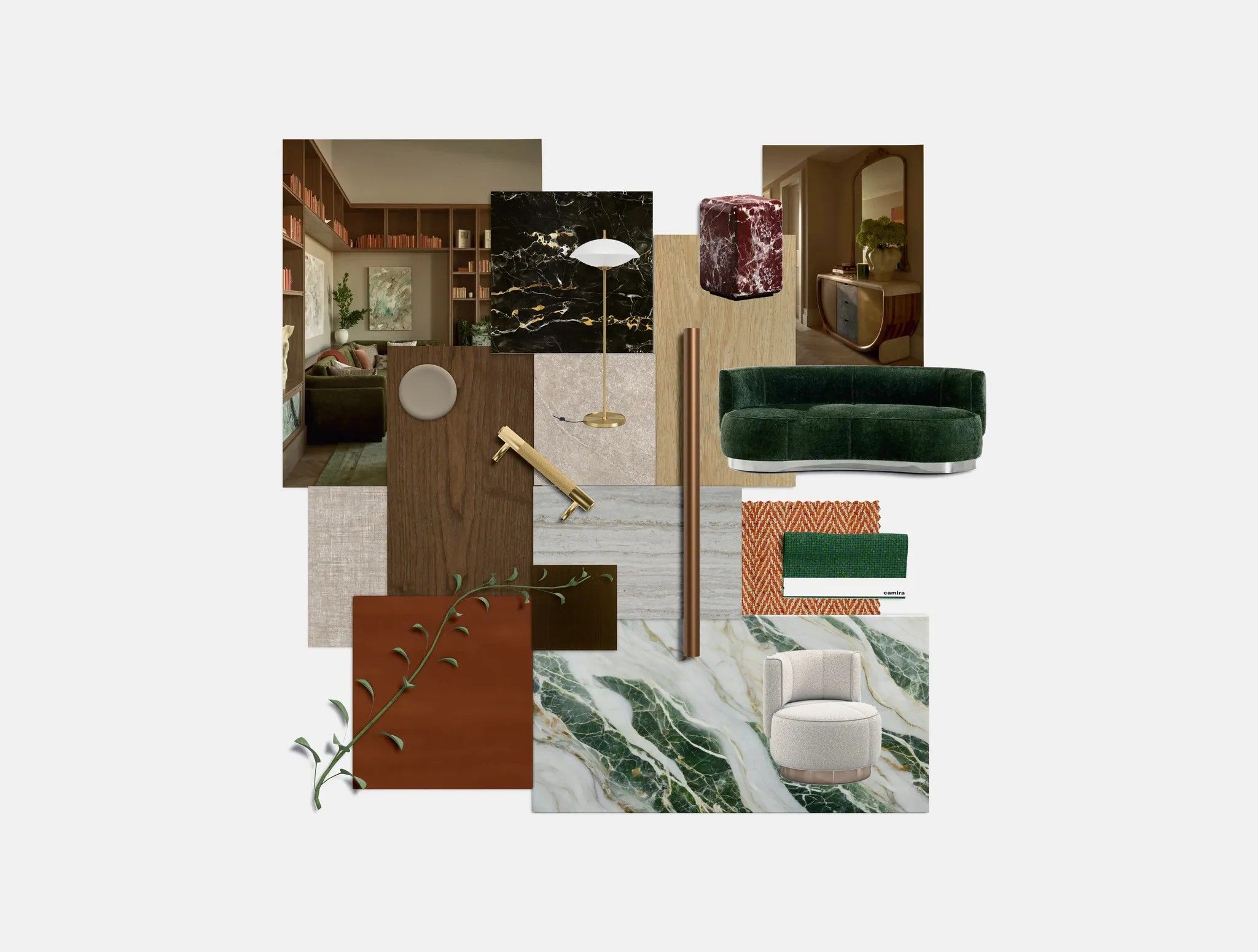
The anchor here is the Yves Round sofa by Minotti, a curve of deep green velvet, and the board's whole argument is how far that one saturated green can travel: into a green-and-white veined marble slab, into rust-and-green wool swatches from Camira. Heritage schemes work when the color spreads across material families instead of repeating in one. The marble is a custom upload, not a catalog product: a board can hold your own samples alongside catalog materials, and the custom swatch stays labeled as custom. Jewels JW11 Black Gold by Mirage, a black porcelain tile with gold veining, gives the scheme its dark edge, while two Hakwood floorings, Misty and Sava, sit side by side as the pale and dark timber options.
Wabi Elegance

Wabi-sabi schemes usually get shown as beige. This one finds its calm in an indigo night-sky mural balanced by the board's largest surface, Almond Yugen Oak by Lamitak, a pale oak laminate, with Tai Ping's Bokeh II rug doing the actual wabi work in hazy, imperfect blues. Dawn by Staron adds a soft grey solid surface. The furniture brings the warmth: the Trio armchair by Minotti in olive and dark green boucle on a black frame, the marble-top Ethan side table by Minotti, and the small brass Flowerpot VP1 pendant by &Tradition.
Earthy Retreat
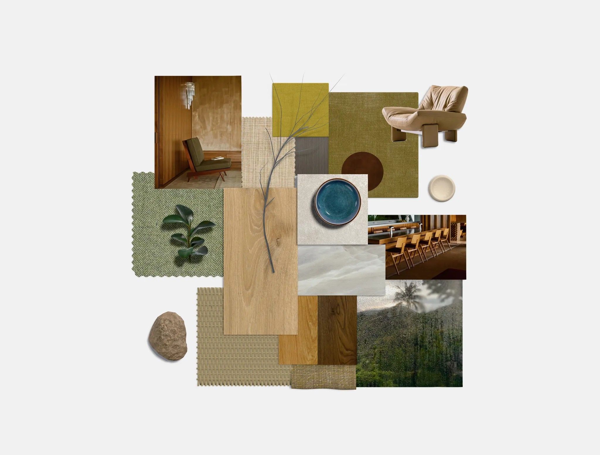
Auditioning three tones of the same supplier's oak on one board, under the same light, is exactly what a materials-first board is for. This one lines up three Hakwood floorings, Pure Brushed, Original and Promise, so the client decides between real planks rather than adjectives. A chartreuse textile, olive wools and a green herringbone round out the palette, Cosmopolitan CP05 White Crystal by Mirage brightens it with a pale stone-look porcelain, and the tan Emmi armchair by Minotti anchors the lighter fabrics with some physical weight.
Serene Modern
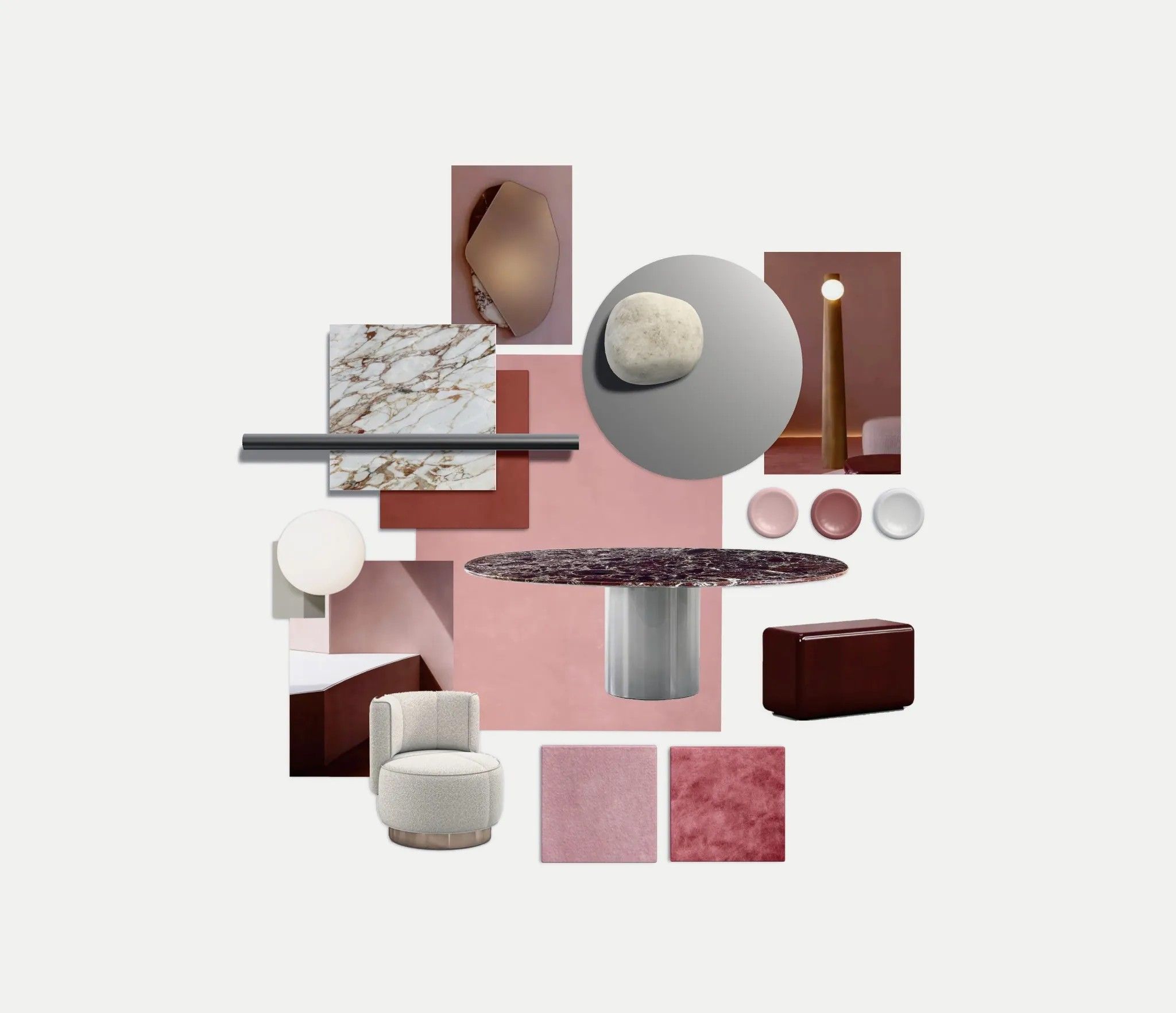
This board runs on proportion: one expressive surface, one dark accent, everything else kept quiet. The expressive surface is Cosmopolitan CP03 Arabescato Oro by Mirage, a gold-veined marble-look porcelain; the dark accent is the Rayan dining table by Minotti, an oval of dark red marble on a steel cylinder base. The pink field around them is painted palette cards and two pink carpet swatches, all custom uploads, which is the other half of the earlier point: a scheme's whole color story can be your own samples while catalog products do the furniture and stone. A Journey SHY2 by &Tradition wall lamp and the cream boucle Yves Round armchair by Minotti, the armchair sibling of Verdant Heritage's sofa, finish it.
One detail worth noticing across the set: the same brushed stainless sample, Hairline + Anti Fingerprint by AAT, appears on three of these four boards, and Minotti's Yves Round shows up twice in different forms. Repeating a material or a family across boards is the cheapest way to make a whole project feel intentional.
How do you make an interior design mood board?
Start from the brief, choose a palette anchor, commit to one hero material, add supporting materials and furniture, then edit down hard. The process takes six steps and most of the skill is in the last one, because a mood board improves more by subtraction than by addition.
Here is the process I actually follow:
- Reread the brief and write one sentence. Before touching any images: "calm weekend apartment for two people who cook" beats any Pinterest search. Every element gets tested against that sentence.
- Choose a palette anchor. One color or tone the client already loves, usually from something they own. Build three to five colors around it.
- Commit to a hero material early. Most designers collect imagery first and choose materials last. I do the reverse: pick the stone, tile, or timber the room will be remembered for, and let it discipline every later choice.
- Add supporting materials and check them against the hero. This is where working with real samples pays off. In a 3D board I can put the carpet next to the stone under the same light and see the undertones argue with each other before the client does.
- Place furniture and lighting. Two or three pieces at honest scale. If the bed is oversized on the board, it will be oversized in the room.
- Edit down and present one direction. Remove everything that survives on charm alone. I aim to present a single confident board with one or two alternates held in reserve, not three boards that ask the client to do my job.
One habit worth building: date your boards and keep the rejected versions. When a client circles back three weeks later asking "what was that greener option?", the answer is one click away.
Which mood board tool should interior designers use?
Pinterest is best for early inspiration gathering, Canva and Milanote are best for quick image collages, and a materials-first platform like Matterbase Board is best when the board has to carry real products through client revisions and into specification. The honest answer depends on which stage of the project you are in.
- Best for: the messy inspiration phase, weeks before a board exists.
- Strengths: unbeatable image volume; clients already use it.
- Limits: no control over layout, no real products, no sense of scale. A Pinterest board is research, not a deliverable.
Canva
- Best for: fast, presentable collages on a budget.
- Strengths: free tier, templates, easy export for decks.
- Limits: everything is a flat image. Materials read as photographs of materials, and nothing on the board links to a purchasable product.
Milanote
- Best for: freeform concept development and note-heavy research.
- Strengths: flexible canvas, good template library, tidy sharing.
- Limits: still image-based at its core. Fine for mood, but the handoff to sourcing and specification happens somewhere else.
Matterbase Board
- Best for: boards that need to become real rooms.
- Strengths: built from actual catalog products with photorealistic 3D material samples you can relight; multiple people can edit the same board live, so client revisions happen in the meeting instead of after it; the board carries straight into a material schedule.
- Limits: it is built around materials and products, so it makes a poor scrapbook. If you want to pin travel photography and typography references, do that phase in Pinterest and bring the winners over.
I use Pinterest and Matterbase together on most projects: one for the "maybe" pile, one for the board the client actually sees. The fair summary is that image tools optimize for how the board looks, and a materials platform optimizes for what the board becomes.
How do you turn a mood board into a material schedule?
Promote each material on the approved board into a line item with a product reference, supplier, finish, and location in the project, then track those line items in a schedule the whole team can see. This is the step that separates a decorative board from a working document, and it is where most image-based workflows break.
With an image collage, the handoff means retyping everything into a spreadsheet and hoping the photo you pinned corresponds to a product that still exists. Working from a materials-first board, the products are already identified, so the schedule is a projection of the board rather than a reconstruction of it. In Matterbase, a board's materials flow into Schedule, where each item carries its specification details and updates in real time as the design changes. When a client swaps the bathroom tile in week six, the schedule follows the board instead of drifting away from it.
If you take one thing from this article, make it this: build the board out of things that can be bought, and the rest of the project's paperwork becomes bookkeeping instead of archaeology.
Frequently asked questions
What is the difference between a mood board and a concept board?
A mood board communicates atmosphere: palette, texture, and feeling, sometimes before a specific room is even confirmed. A concept board applies that atmosphere to the actual project, connecting the mood to the floor plan, the brief, and the client's constraints. Many designers merge the two into a single early-stage board.
Is there a free way to make an interior design mood board?
Yes. Canva and Milanote both offer free tiers that handle image collages well, and Pinterest costs nothing for inspiration gathering. Matterbase Board is also free to start, which matters if you want the board built from real materials rather than photographs from the beginning.
How many images should a mood board have?
Fewer than feels natural, usually eight to twelve elements. Past that point the board stops communicating a direction and starts documenting your research. If two elements say the same thing, keep the one you can source.
Are physical mood boards still worth making?
For final presentations, sometimes: nothing replaces holding a real timber sample against a real fabric. But physical boards are slow to revise and impossible to share with a remote client. A common professional pattern is digital boards for iteration, followed by physical samples of the two or three hero materials at sign-off.
Can clients collaborate on a mood board in real time?
On image tools, collaboration usually means comments after the fact. On Matterbase Board, several people can edit the same board simultaneously, so a revision meeting works like a shared document: the client watches the tile swap happen and reacts to it live, which shortens the approval loop considerably.
The fastest way to test this workflow is to rebuild your current project's mood board from real materials and see what survives. Start a board in the material board creator, pull products from the catalog, and let the concept and the specification be the same thing from day one.